
Redesigning grocery shopping for scale
App Merqueo
U S E R E X P E R I E N C E /
V I S U A L I N T E R F A C E /
U I R E D E S I G N
Redesign of the Merqueo mobile app to modernize the brand experience and improve usability.
The goal: reduce friction, increase efficiency, and create a scalable design system for long-term growth
Live product ->

CHALLENGE:
Merqueo needed a visual refresh of its mobile app to modernize the brand and improve usability. The existing interface felt outdated, making product discovery harder and checkout less intuitive — which impacted the shopping experience and conversion rates.
In 2019–2020, I worked on the redesign of Merqueo’s mobile app to improve search visibility, scannability, and the overall shopping flow. The goal was to reduce friction, increase efficiency, and build a consistent design language that could support the product’s rapid growth across LATAM.
MY ROLE:
Product Designer
I collaborated with PMs, engineers, and a team of 4 designers to reimagine Merqueo’s mobile product. My contributions included:
-
Leading visual exploration and defining a scalable typographic system.
-
Designing and prototyping key flows (home, search, product detail, checkout).
-
Partnering with stakeholders to align early decisions with product strategy.
-
Preparing a usability testing plan (task-based, N=20) to measure impact after launch.
-
Supporting early design system foundations to drive consistency across screens.
PROCESS OVERVIEW:
-
Discovery → Prototyping → Validation → Delivery
KPIs:
While metrics were not tracked during the project, these were the goals identified to measure success after launch:
At the time, product analytics were not deeply integrated, but the redesign was framed around clear measurable goals:
-
Search CTR: target +15% by making the search bar more prominent.
-
Task efficiency: target −10% reduction in time to find products through clearer hierarchy and navigation.
-
Add-to-cart rate: target +8% uplift via simplified product detail pages and stronger CTAs.
-
Conversion from home: target +5% by reducing clutter and improving the path to checkout.
-
Usability score (SUS): target +10 points improvement through moderated testing.
Measurement approach (2019–2020):
-
Event tracking in Google Analytics.
-
A/B testing to compare search placement and visual changes.
-
Moderated usability sessions with customers (N=20) to validate flows and efficiency.


VISUAL DESIGN DESICIONS:
The visual refresh aimed to improve clarity, hierarchy, and brand consistency while making the shopping journey more intuitive.
-
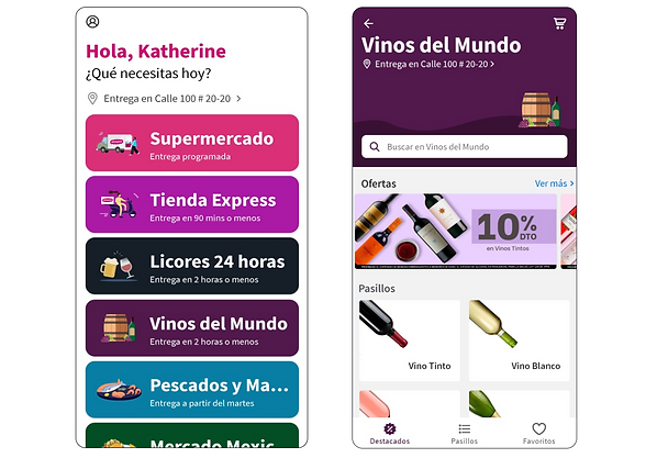
Personalization at entry point: Greeting the user by name and highlighting delivery options upfront creates a sense of relevance and reduces cognitive load at the start.
-
Simplified navigation: Categories were consolidated into clear tiles with consistent iconography and strong color contrast, improving scannability across shopping modes.
-
Stronger search affordance: A persistent search bar was prioritized at the top of each screen to accelerate product discovery.
-
Visual hierarchy in offers: Promotional banners were standardized in placement and style, preventing clutter while still drawing attention to discounts.
-
Consistent card system: Product aisles now use a uniform card grid with imagery and concise labels (e.g., “Vino Tinto,” “Argentina”), helping users browse faster and compare options more easily.
-
Brand alignment: Refined color palette and typography create a cohesive look aligned with Merqueo’s updated brand identity, making the product feel more trustworthy and modern.
What I learned:
This project became a milestone in my career, giving me the chance to own the full end-to-end product experience within a startup environment. It strengthened my ability to connect design decisions with business outcomes and to lead collaboration across teams.
Key learnings:
-
The importance of balancing business KPIs with user needs to drive measurable impact.
-
How early stakeholder alignment avoids costly redesigns later in the process.
-
That even small improvements in navigation and search can generate a big difference in overall conversion.