

Redesign
Home Online
App SoyRappi
U X D E S I G N /
U X R E S E A R C H /
V I S U A L I N T E R F A C E
Redesign of the experience for delivery people during the waiting time for order assignment for the Rappi delivery app (SoyRappi)
PROBLEM:
The home or main screen that RTs (rappitenderos) saw was not a thought-out experience, but rather a fragmented one between things that were added, removed or moved to other flows.
Rappi's growth rate has been very fast and at the same time the App used by rappitenderos (Soy Rappi) has had to go through several transitions where elements were added as the product grew and more functions were added from the business.
CHALLENGE:
Understanding how the experience worked across the board for users, since each squad or area had expectations and elements of what the home should be, but for the user (rappitendero) the experience is one. From that understanding, defining an organized and coherent experience with the moments and conditions of each rappitendero, in addition to refreshing and modernizing the interface that at that time seemed like elements without visual cohesion.
Work team:
Katherine Moreno
(Product Designer)
Diana Ituriza
(Product Designer)
Silvina Klein
(Lead Design Fulfillment)
At a cross-level: product managers from various teams that allowed us to delve deeper into the understanding or importance for the business of certain features
This project was developed over 3-4 months at RAPPI in parallel with other projects (design/research) and one of the members left the company halfway through the project, so I was able to work on it in more depth and I loved it because I love redesigns :)

How the online home works:
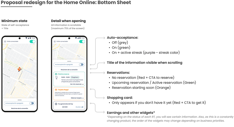
The RT logs into SoyRappi and connects to receive orders and arrives at the home page. On this screen, depending on the connection status of each RT, certain scenarios are activated or not, such as:
- Auto-acceptance on or off.
- Streak (a certain number of orders placed in a row) the RT is prioritized and more orders are sent to it.
- Reservations about to start or a suggestion to reserve
BENCHMARK AND COMPETITIVE ANALYSIS
Rappi is an app that is available in several Latin American countries (+Brazil) and in most of them, delivery people work with several apps with a similar core business, so to start we wanted to understand the advantages/disadvantages of the platforms they use and also some in other areas (like the US or Europe) that have been a reference for business and product, such as:
-
Didi
-
Ifood
-
Uber Eats
-
Doordash
-
Instacart
In this bench we used several methods such as: Downloading the apps and browsing them, screenshots of videos on YouTube (uploaded by delivery people) and shadowing with RTs.
For shadowing, we contacted RTs who were active on SoyRappi and who delivered on other apps apart from Rappi, we did sessions where they shared their screen using the other apps and told us what they liked and what they didn't. We wanted to investigate usability and information architecture, so we focused on things like:
- Which home page did they find information on the fastest?
- What type of information was the most valuable to see when they first logged in?
- Which apps seemed easiest to use and why?
- Which apps were clearer in the instructions or steps to follow.
From everything they told us and showed us, we took screenshots to add to the benchmark, and some specific findings.


What did we analyze?
Broadly speaking, the offline home (before connecting) and the online experience (when it is ready to receive orders) to understand how the information was handled, the prioritization, etc.
Findings
After gathering all the information and analyzing both the current design and that of the competitors, I decided to focus on improving some points such as:
-
The auto-accept button (it was not clear if it was on or off).
-
Grouping the information (the information was scattered in different parts of the map and the home screen)
-
Prioritizing the actions so as not to make them think and give them a reading order.
-
The font size was not legible.
-
Detailing the information more, since when trying to summarize everything, the RT overlooked many things or they did not understand them
-
Making the interface cleaner (and modernizing the UI

After sketching, brainstorming, and analyzing various options and forms of interaction, a bottom sheet turned out to be the best option for what we needed. We could use it as a container for multiple topics, without losing visibility of the map, or having to give up space or font size.
This is one of the biggest projects where I have ever been involved in (especially cause of the number of users the app has) and the one in which I have best understood the work as a product designer, being on top of the product, looking for consistency, and thanks to this particular project, from design we were able to start proposing several redesigns and give more shape to other projects or flows, improving visual cohesion and usability. It is a huge project that is constantly adapting to the pace and needs of the business.